
Theodore Lowe, Ap #867-859
Sit Rd, Azusa New York
Find us here
Photoshop Text Shadows: Master Stunning Effects Easily

Whether you're a graphic designer looking to elevate your projects or a beginner eager to learn new techniques, this guide is tailored just for you. Discover how to create stunning text shadows that add depth and flair to your designs with step-by-step instructions that are simple to follow.
Unlock the secret to captivating visuals that not only draw attention but also leave a lasting impression. Ready to take your Photoshop skills to the next level? Dive into this comprehensive guide and watch your creativity soar.
Basics Of Text Shadows
Text shadows create depth and interest in digital designs. They enhance readability and make text pop. Learning to use them effectively can improve design quality. In Photoshop, text shadows are simple to create but require understanding of basic principles.
What Are Text Shadows?
Text shadows are effects that simulate a shadow behind text. They give the illusion of raised or sunken letters. This visual trick draws the viewer's attention.
Why Use Text Shadows?
Text shadows make text stand out. They improve contrast and make text more readable. Shadows add a professional touch to digital creations.
Types Of Text Shadows
Photoshop offers various shadow types. Drop shadows mimic light source effects. Inner shadows create depth within text. Each type serves a different purpose.
Choosing Shadow Colors
Shadow color affects design mood. Dark colors create mystery. Light colors add a subtle touch. Choose colors that complement your design theme.
Adjusting Shadow Opacity
Opacity controls shadow transparency. Higher opacity creates bold shadows. Lower opacity results in softer effects. Balance opacity for clear text visibility.
Setting Shadow Angles
Shadow angle simulates light direction. A 45-degree angle is common. Experiment with angles for dynamic effects. Consistent angles enhance design harmony.
Understanding Shadow Distance
Distance determines shadow placement. Closer shadows create tight effects. Farther shadows add dramatic depth. Adjust distance for desired impact.
Combining Shadows
Multiple shadows can be layered. Combine different types for unique effects. Experiment to find creative combinations. Layering adds complexity to designs.
Choosing The Right Font
Choosing the right font is crucial in creating text shadows that stand out. The font is not just about style; it's about personality. It affects how your text interacts with shadows and the overall impact on your design. The right font can elevate your work, making it memorable and eye-catching.
Understanding Font Types
Fonts come in different types: serif, sans-serif, script, and decorative. Each type has its unique characteristics. Serif fonts, with their little strokes at the end of letters, convey tradition and formality. Sans-serif fonts are clean and modern, ideal for straightforward designs. Script fonts add elegance and flair, while decorative fonts can infuse your design with creativity and uniqueness.
Matching Fonts With Shadows
Not every font pairs well with every shadow. Bold fonts work well with deep shadows, providing a dramatic effect. On the other hand, thin fonts are best paired with subtle, soft shadows. Think about the mood you want to create. A strong shadow on a bold font might suggest confidence, while a gentle shadow on a script font can evoke sophistication.
Considering Readability
Readability should be a priority when selecting fonts for text shadows. A font that looks great in design might not be easy to read. Test different fonts by adding text shadows and see which combination maintains clarity. Your audience should be able to read your text easily without straining their eyes.
Experimenting With Font Styles
Don't be afraid to experiment with different font styles. Bold, italics, and underlined fonts can change the dynamic of your text shadows. Try mixing styles to see what works best for your project. You might find a combination that adds a unique touch to your design.
Considering Font Size
Font size affects how shadows appear. Larger fonts allow shadows to be more pronounced, giving a strong visual impact. Smaller fonts require delicate shadows to maintain balance. Adjust font sizes and shadows to find the perfect harmony for your design.
Have you ever chosen a font that didn't quite fit the shadow effect you wanted? How did you solve it? Share your experiences in the comments below and let’s learn from each other’s design journeys.
Layer Styles Panel
Explore the Layer Styles Panel in Photoshop to create impressive text shadows. This guide offers easy steps for beginners, helping achieve stunning effects with minimal effort. Enhance your designs by understanding how different shadow settings can transform text in creative ways.
The Layer Styles Panel in Photoshop is your gateway to creating dynamic text shadows that add depth and dimension to your designs. This panel is a powerhouse of options, offering everything you need to manipulate and enhance your text's visual impact. If you've ever wondered how designers make text pop off the page, the secret often lies within this versatile tool.
Understanding The Layer Styles Panel
Open your Photoshop project and locate the Layer Styles Panel. It's typically found in the Layers menu or by double-clicking a layer. This panel is your control center for effects like shadows, glows, and strokes. Experiment with different settings to see how they alter your text's appearance. Each tweak can drastically change the mood of your design.
Adding A Drop Shadow
To add a drop shadow, select the text layer you want to modify. Click on the "fx" icon at the bottom of the Layers panel, then choose "Drop Shadow" from the menu. Adjust the shadow's angle, distance, and opacity. Play around with these settings to find the perfect balance that complements your design.
Exploring Inner Shadows
Inner shadows add a subtle depth by darkening the edges inside the text. This effect can make your text look engraved or recessed. Select "Inner Shadow" from the Layer Styles Panel. Tweak the size and softness for a more pronounced effect.
Using Multiple Shadows
Did you know you can stack multiple shadows for a unique look? This technique allows you to create complex and layered text effects. Add a new shadow by clicking the "+" button next to the shadow effect. Each shadow can have different settings, offering endless possibilities.
Customizing Shadow Colors
Shadows aren't limited to black or gray. Experiment with colors that match your design palette for a cohesive look. Open the color picker in the shadow settings. Choose a color that enhances your text's visibility and overall aesthetic.
Practical Tips For Realistic Shadows
Keep your shadows consistent with your light source. This small detail can make a big difference in realism. Use softer shadows for lighter backgrounds. This prevents the shadow from overpowering the text.
Final Thoughts On Layer Styles
The Layer Styles Panel is a treasure trove for designers. By understanding its potential, you can elevate your text designs from ordinary to extraordinary. Are you ready to experiment with these tools and transform your text? The possibilities are at your fingertips.
Drop Shadow Essentials
Crafting text shadows in Photoshop enhances your designs beautifully. A step-by-step guide helps achieve stunning effects. Explore the essentials to create eye-catching drop shadows with ease and precision. Transform ordinary text into captivating visuals effortlessly.
Creating a drop shadow in Photoshop can elevate your text, giving it depth and a professional edge. Mastering this essential technique can make a significant difference in your design projects. When I first started using Photoshop, I underestimated the impact of a well-crafted drop shadow. But with practice, I realized how these subtle effects can transform a flat design into something captivating. Ready to make your text pop? Let’s break down the essentials.
Adjusting Distance
The distance setting in the drop shadow effect controls how far the shadow is from the text. A short distance gives the impression of a light source directly above, making the text appear to hover just above the surface. A greater distance can make the text appear as though it's floating in space. Try starting with a distance of around 5 to 10 pixels and adjust according to your design's needs. Experiment with different distances to see what works best for your project. If you're working on a minimalist design, a subtle shadow might be all you need. For more dramatic designs, don't be afraid to push the boundaries.
Modifying Spread
Spread determines the thickness and intensity of the shadow. A higher spread will make the shadow more pronounced and bold, while a lower spread keeps it light and soft. Imagine you're trying to create a shadow on a sunny day; a high spread mimics those harsh afternoon shadows, while a low spread is like the soft shadows of an overcast day. As a beginner, I often made the mistake of setting the spread too high, resulting in a harsh and unnatural look. To find the right balance, start with a lower spread, around 5%, and gradually increase until you're satisfied with the effect.
Tweaking Size
The size of the drop shadow affects its blur, making the shadow appear softer or sharper. A small size creates a crisp shadow, while a larger size results in a more diffused, dreamy effect. In most cases, a size between 5 and 15 pixels is a good starting point. Consider the mood you're trying to create. A soft, large shadow might work well for text on a dreamy landscape, while a sharp, small shadow could add a modern touch to a tech design. When tweaking size, ask yourself, "Does this shadow enhance my text, or is it a distraction?" Remember, the key to mastering drop shadows lies in experimenting with these settings. Spend time adjusting each parameter and observe how they interact. Your unique touch will shine through when you balance these elements effectively. What will your next text shadow creation say about you?
Crafting Inner Shadows
Inner shadows add depth to text, making it appear more dynamic. Unlike outer shadows, these shadows simulate the appearance of light hitting from the inside. They create a subtle yet impactful effect that enhances text aesthetics. This guide breaks down the process, helping you craft inner shadows with precision.
Understanding Light Source
The light source determines shadow direction. Imagine a lamp above your text. Shadows fall opposite to the light. Adjusting light angle changes shadow placement. Experiment with different angles for desired effects. A consistent light source maintains visual harmony.
Fine-tuning Opacity
Opacity controls shadow visibility. Lower opacity for subtle shadows. Increase for dramatic effects. Balancing opacity is key to realistic shadows. Too much opacity can overpower text. Aim for a natural blend with text color. Adjust until you achieve the right balance.
Using Gradients For Depth
Creating depth in text shadows can transform ordinary designs into captivating visuals. Using gradients adds a realistic touch, making text pop. This guide explores how gradients enhance text shadows in Photoshop. The technique offers a sophisticated look with minimal effort. Let's dive into the steps to achieve this stunning effect.
Gradients provide a smooth transition between colors. They mimic natural light and shadow effects. Start by selecting the text layer in Photoshop. Navigate to the Layer Style menu. Choose "Gradient Overlay" from the options. This feature allows you to apply color transitions to your text shadow.
Choosing The Right Gradient Colors
Picking the right colors is crucial. Opt for shades that complement your text color. A darker gradient can add dramatic depth. Lighter gradients offer subtlety. Experiment with different color combinations. Test how they interact with your background.
Adjusting Gradient Angle
The gradient angle affects shadow direction. Open the Gradient Overlay settings. Look for the angle adjustment slider. Set the angle to match your desired shadow direction. Angles can be tweaked for different effects. Keep the angle consistent with your design theme.
Fine-tuning Gradient Scale
Scale determines the gradient's spread. A larger scale covers more area. A smaller scale focuses the transition. Adjust the scale to suit your text size. Larger text may need a bigger gradient scale. Smaller text benefits from a tighter scale.
Preview And Adjust
Always preview your gradient application. Check how the shadow looks on the screen. Adjust settings if necessary. Minor tweaks can enhance the final result. Use this step to ensure everything looks perfect.
Combining Multiple Shadows
Create stunning text effects in Photoshop by combining multiple shadows. Enhance depth and dimension for captivating visual impact. Transform ordinary text into eye-catching designs with ease.
Combining multiple shadows in Photoshop can elevate your text design. By layering shadows, you create depth and dimension. This technique can make your text more appealing and professional. Follow these steps to explore the possibilities of combining shadows.
Understanding The Basics Of Shadow Layering
Layering shadows involves using different shadow styles. Each layer adds a unique touch. Start by selecting the text layer in Photoshop. Then, open the Layer Style menu. Choose the Drop Shadow option. Adjust the settings to your liking. Create a new shadow layer for each effect.
Creating Depth With Varied Opacity
Opacity affects how visible a shadow is. Lower opacity for a subtle effect. Higher opacity for bolder shadows. Experiment with different opacity levels. This helps achieve the desired depth and realism.
Playing With Shadow Angles
Shadow angles determine the direction of the light source. Change the angle to alter shadow direction. This can simulate different lighting conditions. Experiment to find the best angle for your design.
Exploring Shadow Color Variations
Color adds another layer of creativity. Use different colors for each shadow layer. This can create a vibrant and eye-catching effect. Choose colors that complement your text.
Adjusting Distance For Greater Impact
The distance setting controls how far the shadow extends. Short distances create subtle effects. Long distances can make shadows more dramatic. Adjust the distance to suit your design needs.
Fine-tuning With Size And Spread
The size setting controls shadow blur. Spread affects how far the shadow extends. Larger size values produce softer shadows. Smaller spread values keep shadows tight. Adjust these settings for the perfect look.
Creating 3d Text Shadows
Create eye-catching 3D text shadows in Photoshop with a simple, step-by-step guide. Learn techniques to enhance your text with stunning effects. Perfect for designers aiming to add depth and style to their projects.
Creating 3D text shadows in Photoshop can elevate your designs from flat and ordinary to dynamic and eye-catching. These effects add depth, making your text pop against any background. Whether you're designing a poster, a website header, or social media graphics, mastering 3D shadows can significantly enhance the visual appeal of your work. But how do you create these stunning effects? Let's dive into the techniques you need to know.
Layer Duplication Techniques
Start by duplicating your text layer. This is crucial for creating depth. Simply right-click on your text layer and select 'Duplicate Layer'. Once duplicated, you will have two layers: one for the original text and another for the shadow. Think of the shadow layer as a foundation. By tweaking its position and color, you can simulate depth.
Utilizing Transform Tools
With your shadow layer selected, use the transform tools to shift and stretch it. Press Ctrl+T (Cmd+T on Mac) to activate the Free Transform tool. Drag the shadow layer slightly down and to the side to create a perspective effect. Consider experimenting with the Warp tool for more complex shadow shapes. How would altering the shadow’s angle impact its realism? Feel free to adjust opacity to soften the shadow, making it blend naturally with your background. Creating 3D text shadows requires practice and experimentation. Try different angles and colors. What works best for your design? By using layer duplication and transform tools effectively, you can create shadows that make your text stand out. Your designs deserve to shine—why not give them the depth they need?
Custom Shadow Brushes
Explore the world of Photoshop text shadows with custom shadow brushes. This guide offers simple steps to create stunning effects. Enhance your designs with unique shadows, adding depth and dimension effortlessly.
Creating stunning text shadows in Photoshop can elevate your design projects, making them more dynamic and visually appealing. One exciting technique to master is using custom shadow brushes. These brushes can give your text a unique depth and texture that standard shadow effects might not achieve. Imagine having the power to craft shadows that match the mood and theme of your project perfectly.
Create Your Own Custom Shadow Brush
Start by selecting a brush shape that suits the shadow effect you desire. Open Photoshop, navigate to the Brush panel, and choose a soft round brush. Adjust the size to fit your text size, ensuring it provides a natural shadow look.
Adjust Brush Settings For Realism
Head to the brush settings to refine your shadow brush. Play with the opacity and flow to mimic natural shadow effects. Consider adding some scatter for a more diffused shadow, giving it an authentic touch.
Test Your Brush On A Text Layer
Apply the custom brush to a text layer to see how it interacts with your design. Use the brush on a new layer underneath your text to maintain flexibility. This allows you to adjust the shadow's position and intensity without affecting the text itself.
Experiment With Different Angles And Distances
Don't hesitate to shift the angle and distance of your custom shadow brush. Move it around to see how it changes the perception of your text. A slight adjustment can dramatically alter the mood and focus of your design.
Save Your Custom Brush For Future Use
Once satisfied with your custom shadow brush, save it for future projects. Go to the brush settings, click on the menu icon, and select “New Brush Preset.” Naming your brush helps you easily locate it when needed. Custom shadow brushes in Photoshop offer limitless possibilities for creativity. They enable you to craft shadows that are as unique as your projects. Have you tried experimenting with custom brushes? How did it change your design approach?
Exporting And Saving
Explore how to export and save your Photoshop creations with text shadows. This guide ensures your stunning effects stay intact. Keep your files ready for any project need.
Exporting and saving your Photoshop project is a crucial step that can make or break your final output. Whether you're crafting a professional presentation or a fun personal project, knowing how to save and export your work correctly ensures you preserve all the intricate details of your text shadows. As you reach the end of your creative process, it's important to choose the right format and settings to maintain the quality and accessibility of your work.
How To Choose The Right File Format
Selecting the appropriate file format can significantly impact the quality and usability of your final image. If you're aiming for high-quality prints, consider saving your project as a TIFF or PSD file. These formats preserve layers and details, allowing for future edits. For web use, JPEG and PNG are your go-to options. JPEG is great for compressing images without losing too much quality, while PNG is perfect for maintaining transparency, which is ideal for text shadows.
Exporting For Web And Devices
When exporting for web, consider the resolution and file size. Lowering the resolution can help your image load faster on websites, enhancing user experience. Photoshop's "Save for Web" feature allows you to preview your image quality and file size, giving you control over these factors. Have you ever wondered how your image appears on different devices? Test your exported file on various screens to ensure your text shadows look stunning everywhere.
Saving For Future Edits
Always save a master copy of your Photoshop project. This way, you can return to your original work and make adjustments without starting from scratch. Use the PSD format to keep all your layers intact, offering flexibility for future changes. Consider organizing your files systematically. Create folders for different projects and label your files clearly. This practice saves time and reduces stress when you need to make quick edits.
Creating A Backup
Imagine spending hours perfecting your text shadows, only to lose your work due to a technical glitch. Regularly back up your files to an external drive or cloud storage. This simple step protects your hard work and gives you peace of mind. Do you have a backup routine? Setting reminders to back up your projects can save you from unexpected data loss.
Sharing Your Work
Once you've exported and saved your masterpiece, it's time to share it with the world. Whether you're posting on social media or sending to a client, ensure your file format is compatible with their needs. Sharing a PNG file might be ideal for social media, while a PDF could be better for professional presentations. Think about your audience when choosing how to share your work. Tailoring your export settings to their preferences can enhance their experience and appreciation of your creative efforts.
Conclusion
Creating text shadows in Photoshop enhances your designs. The steps are straightforward and easy to follow. Experiment with different shadow styles. Make your text stand out beautifully. Shadows add depth and interest to text. Practice these steps regularly. Soon, you'll craft impressive effects effortlessly.
Your designs will capture attention and engage viewers. Text shadows are a powerful tool in digital design. Keep exploring and refining your skills. Enjoy bringing your creative visions to life.
Related blog posts
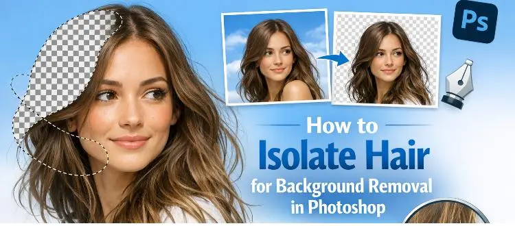
How to Isolate Hair for Background Removal in Photoshop
Are you tired of spending hours trying to perfectly isolate hair from a background in Photoshop, only to end up with messy, unnatural edges? You're not alone.
Clipping Path Associate has empowered businesses globally for over 12 years. A passionate team is dedicated to providing meticulous photo editing services. Expertise is offered in a range of areas, from precise clipping paths to flawless image retouching. The company offers straightforward yet impactful solutions tailored for photographers, e-commerce enterprises, advertising agencies, web design firms, magazine publishers, printing companies, and more.
We Accept :