
Theodore Lowe, Ap #867-859
Sit Rd, Azusa New York
Find us here
Optimizing Images for Web and Performance
The foundation of web content is images, which frequently increase visitor interest and drive engagement. However, websites with a large number of unoptimized images may have slow load times, which can impair user experience and hurt search engine rankings. One of the most important factors Google uses to rank pages is speed and efficiency, which can be maintained by your website with a well-executed image optimization approach.
By using several compression algorithms that preserve the image's visual integrity and choosing the right image format, such as JPEG, PNG, or WebP, it is crucial to strike a balance between file size and visual quality. Images those are responsive to varying screen sizes improve the user experience and help devices operate better overall. Gaining proficiency with these methods can improve the user experience overall, enhance SEO, and speed up page loads.
The Importance of Image Optimization
The importance of image optimization cannot be understated in today's web landscape. Images are integral to web design, storytelling, and content delivery. Yet, improperly optimized images can drastically affect website performance. Understanding the balance between visual quality and file size plays a pivotal role in creating a fast and engaging online experience. Let's dive into the core benefits of optimizing images effectively.
The Impact on Page Load Speed
Heavy, unoptimized images slow down page load times significantly. Websites with fast load times retain visitors better. A delay in load time leads to:
- Increased bounce rates: Visitors may leave if a site takes too long to load.
- Reduced engagement: Slow pages demotivate users from interacting with content.
- Lower conversion rates: A fast-loading page is more likely to convert visitors into customers.
Compressed and properly formatted images strike a balance. They maintain visual quality while ensuring pages load swiftly.
Enhancing User Experience
Image optimization significantly contributes to a smooth online experience. Optimized images ensure:
- Quicker media loading on various devices.
- Consistency in visual elements across platforms.
- Accessibility for users with limited bandwidth.
High-quality, fast-loading images are essential. They keep users engaged and happy, increasing the likelihood of them staying on your site.
SEO Benefits and Better Rankings
Search engines prioritize sites that load quickly and offer a good user experience. Image optimization is critical for SEO because:
|
SEO Factor |
Reason |
|
Page Speed |
Direct ranking factor for Google. |
|
Responsive Images |
Improve mobile-friendliness of a site. |
|
Image Alt Text |
Enhances accessibility and context for search engines. |
Optimized images also help in accumulating organic traffic through image searches. This process brings more exposure to your site and content.
Understanding Image File Formats
Selecting the correct image format is a vital step in website design. Different formats serve different purposes. Some keep the image quality high. Others make file sizes small. Let's dive into the details of the most common formats.

Jpeg
JPEG stands for Joint Photographic Experts Group. It's a widely used format. JPEG images have a balance of quality and file size. This format uses compression to reduce file size. It works well for photographs and complex images.
Gif
The GIF, or Graphics Interchange Format, handles simple images well. It supports animations and transparent backgrounds. But GIFs are limited to 256 colors. This makes them less suitable for full-color photos.

Png
PNG, which stands for Portable Network Graphics, is a step up from GIFs. PNGs offer better quality with support for millions of colors. They also provide transparency. But this comes with larger file sizes.
Webp
WebP is a modern format created by Google. It offers excellent compression and quality. WebP's advanced features support both lossless and lossy compression. This makes it ideal for a variety of web images.
- For high-quality photographs, use JPEG.
- For simple graphics or animations, opt for GIF.
- When you need transparency, choose PNG.
- For the best balance between quality and size, WebP is your friend.
Tools and Techniques for Image Optimization
Fast loading websites offer better user experiences. Optimizing images is vital for web performance. Learn useful tools and techniques to speed up your site.
Popular Software Options
Image optimization software can drastically reduce file sizes. Here's a list of user-friendly programs for quick results:
- Adobe Photoshop: Offers advanced features like 'Save for Web'.
- GIMP: A free alternative with robust exporting options.
- ImageOptim: Mac users love this for its simplicity and effectiveness.
- TinyPNG: Simple interface for PNG and JPEG compression.
- Photopea: A browser-based tool similar to Photoshop.
Online Services and Their Features
Many online services offer easy-to-use image optimization.
|
Service |
Features |
File Types |
|
ImageOptim Web |
Drag-and-drop, batch processing |
PNG, JPEG, GIF |
|
Kraken.io |
Plugin integration, API |
PNG, JPEG, SVG |
|
Compressor.io |
High compression rates |
PNG, JPEG, SVG, GIF |
|
Cloudinary |
Comprehensive media management |
JPEG, PNG, WEBP |
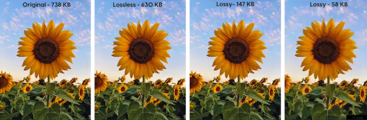
Lossy Vs. Lossless Compression
Understanding compression types helps choose the best for your needs.
Lossy Compression
- Reduces file size by removing data
- Good for web where smaller size is more critical
Lossless Compression
- Maintains original quality
- Ideal for archiving and editing purposes
Both methods have their place in image optimization. Choose wisely based on your specific requirements!
Responsive Images for Different Devices
Responsive Images for Different Devices is critical for a seamless web experience. With the variety of devices used to access the web, images must adjust to different screen sizes. This ensures fast loading times and crisp visuals across mobile phones, tablets, and desktops.
Adapting Images for Multiple Screens
Websites must cater to numerous devices with diverse resolutions. Adapting images for multiple screens is necessary. This prevents pixelation on high-resolution devices and reduces unnecessary data load on smaller screens.
- Optimize for high density: Ensure images look sharp on retina displays.
- Compress wisely: Use tools to shrink image file sizes without losing quality.
- Test responsiveness: Check how images adjust on various devices before going live.
Using Srcset and Sizes Attributes
The srcset and sizes attributes in HTML5 offer control over image display. Use these to define different image files for various display conditions.
|
Attribute |
Function |
|
srcset |
List of images for different resolutions |
|
sizes |
Displays the correct image based on viewport width |
Below is an example of proper implementation:
This code helps browsers to load the optimal image size, improving performance and user experience.
Best Practices for Handling Images
Embracing best practices for handling images on your website is crucial for both user experience and search engine ranking. Images can enhance engagement but may also slow down your site if not optimized properly. The key lies in managing the balance between quality and performance.
Image Sizing and Aspect Ratios
Getting the size and aspect ratio right for images is essential. It ensures that your visuals look good on any device and don't delay page loading times.
- Choose standard aspect ratios to keep images looking consistent.
- Resize images to the maximum display size they will be viewed at.
- Use responsive image techniques such as the srcset attribute to serve different sized images based on the device.
Efficient Image Delivery Systems
Serving images efficiently is all about delivering high-quality visuals with minimal delay. Three key methods stand out:
- Content Delivery Networks (CDNs) can distribute your images across global servers, reducing latency.
- Image formats like WebP offer quality visuals at smaller file sizes, boosting load times.
- Implement lazy loading, so images load only when they’re about to enter the viewport.
Caching For Faster Load Times
Caching images can drastically cut down load times for repeat visitors. Here’s how:
|
Method |
Benefit |
|
Browser Caching |
Stores images locally in user’s browser |
|
Server-Side Caching |
Prebuilt pages ready to serve instantly |
|
CDN Caching |
Localized data reduces load time |
Configure cache control headers to set how long browsers should store your images. Fine-tuning this ensures content is fresh yet loads rapidly.
Testing and Monitoring Image Performance
Smart image optimization leads to faster websites. Testing and monitoring image performance is crucial. It tells us if images load quickly and look good on any device. Let's explore tools and tactics to make sure our images are at their best!
Utilizing Web Performance Test Tools
Web performance test tools can identify image issues. They pinpoint what slows down a site. Use these tools to test image speeds:
- Google PageSpeed Insights: Offers optimization suggestions.
- GTmetrix: Provides performance scores and detailed reports.
- Pingdom: Analyzes each element's load time.
Select the right tool that fits your needs.
Analyzing Results and Making Adjustments
Once you test images, analyze the data. Look for these key metrics:
|
Load Time |
Size |
Format |
|
How quickly does the image load? |
Is the image file too big? |
Is it the right format for web (JPEG, PNG, WebP)? |
Take action based on these insights. Resize or compress images. Change the format. Retest to measure improvements. Keep tweaking until you get the best performance.
Conclusion
Streamlining your web images is crucial for faster load times and better user engagement. By embracing the techniques discussed, such as proper formatting, compression, and responsive design, you can significantly enhance your site's performance. Remember, optimized images not only improve speed but also bolster SEO rankings, providing a superior online experience for your audience.
Related blog posts
How to Isolate Hair for Background Removal in Photoshop
Are you tired of spending hours trying to perfectly isolate hair from a background in Photoshop, only to end up with messy, unnatural edges? You're not alone.
Clipping Path Associate has empowered businesses globally for over 12 years. A passionate team is dedicated to providing meticulous photo editing services. Expertise is offered in a range of areas, from precise clipping paths to flawless image retouching. The company offers straightforward yet impactful solutions tailored for photographers, e-commerce enterprises, advertising agencies, web design firms, magazine publishers, printing companies, and more.
We Accept :